Infographics is visual representations that use a combination of graphics, images, text, and colour to present complex information in a clear, concise, and memorable way. Infographics may use different types of charts to weave a story around a topic. Bart charts, pie charts, line charts, maps, traffic lights, speedometers etc may be used depending on the context and data type.
Infographic charts are a useful resource for a variety of applications and sectors because they can communicate complex information in a way that is interesting, memorable, and simple to understand.
There is no dearth of tools to create interesting and informative charts. However, spreadsheet being the most popular tool for data analysis comes in most handy.
Creating an infographic chart in Microsoft Excel is relatively straightforward and here we will focus on a few simple bar charts which can make your story and visualization impactful.
- Stacked Column Chart with image Overlay
- Representing percentage using infographics
- Representing percentage using fill area of images
- Representing data through stacked images
- Representing data through stretched images
Stacked Column Chart with image overlay
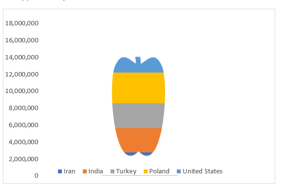
A plain stacked column chart can be converted into an interesting infographics by overlaying any relevant image over the bar graph.
This chart shows top five apple producing countries after China. The graphic has an image of an apple overlayed over the chart.

Check out this YouTube video to make a chart like this ->
Representing percentage using infographics
This bar chart shows the percentage of Titanic passengers who survived. Note the dynamic nature of the chart. Change in the highlighted cell results in the change in the bar length.

Check out this YouTube video to make a chart like this
Representing percentage using fill area of images
This method can be used to make impactful comparison across two categories.
In any domain it is common to perform gender wise percent comparison for any attribute. Infographic can be easily made by overlaying the data over the male and female image as shown below.
The infographic below shows the survival percentage across male and female population.

Check out this YouTube video to make a chart like this
Representing data through stacked images
This technique can be used to Compare percentages across multiple categories. A simple bar charts can be converted into attractive infographics by stacking multiple images to make the information sharing more interesting.
The one below shows the percentage survival across passenger ticket class in titanic ship wreck.

Click here for YouTube video for instructions.
Representing data through stretched images
Instead of stacking multiple images to portray the data, we can use a single image and vary its size depending on the magnitude of the data.
The infographic below shows the area of continents in 1000 square km.

Check out this YouTube video to make a chart like this
Infographic charts are really fun and simple to make. Do try them out next time you plan to tell any story.
Follow this link to get the prebuilt link to these charts for free along with the instructions on how to use them -> Get Free Template


This post is actually a good one it assists new the web viewers, who are wishing for blogging.