With the abundance of data available, it can be easy to overwhelm your audience. Therefore it’s crucial to use visualization techniques that not only capture attention but also provide valuable insights at a glance.
In this blog post, we’ll explore three simple charts that can elevate your data visualization game to the next level.
- Funnel Chart
- Heatmaps
- Sparklines
Incorporating these charts and help you tell a more compelling story with your data and engage your audience on a deeper level.
Let us learn more about them.
Funnel Charts: Visualizing Progression and Conversion

Whether it’s tracking sales leads, customer journeys, or website conversions, funnel charts are a powerful tool for illustrating progression and conversion rates across various stages of a process. They offer a clear visual representation of how entities move through different stages.
Use a funnel chart to visualize the steps involved in completing a purchase on your website, from adding items to the cart to completing checkout. By seeing where customers are dropping off, you can identify areas for improvement and optimize your conversion funnel.
The funnel’s narrowing shape intuitively showcases the drop-off rates between stages, enabling you to focus your efforts where they’re needed most.
Heatmaps: Unveiling Patterns

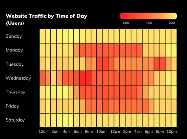
Heatmaps provide a visually striking way to uncover patterns, trends, and correlations within large datasets. By color-coding data points based on their values, heatmaps allow viewers to discern hotspots of activity or areas of interest instantly.
Use a heatmap to visualize website traffic data, where hotter areas represent sections of the website that receive more visitors. This can help you identify which content is most popular and optimize your website layout for better user engagement.
Sparklines: Condensing Trends into Compact Spaces

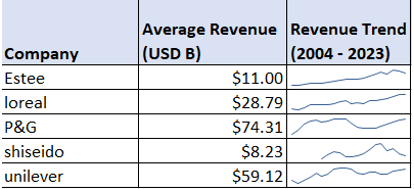
Miniature line charts embedded directly within text or data tables, sparklines provide a quick and easy way to visualize trends in data without cluttering your visualizations.
You can use sparklines to show trends in stock prices over time next to each stock price in a table. This allows viewers to see both the individual data points and the overall trend at a glance.
Conclusion
Whether you’re tracking sales funnels, analyzing website traffic, or monitoring financial trends, these visualization techniques offer a holistic perspective that transcends traditional data presentations.
Transform complex datasets into compelling narratives, leverage these techniques to help stakeholders extract actionable insights from data.
Here are some additional tips for using these visualization techniques:
- Keep it simple: Avoid overloading your visualizations with too much data or too many colors.
- Use clear labels and titles: Make sure your audience can easily understand what the visualization is showing.
- Consider your audience: Tailor your visualizations to the needs and interests of your audience.
With a little creativity, you can use these techniques to take your data visualization to the next level and unlock the power of your data.


